
HEALTHY HEARTS
Healthy Hearts are an organisation that helps people get through the struggles of a new heart bypass by building an interwoven community of individuals also going through recovery.
They offer; support, advice, daily tips to ease life after operations and community support meetings, where you can share your experiences about your journey.
SERVICE
Logo Design
Brand Identity
Print Materials
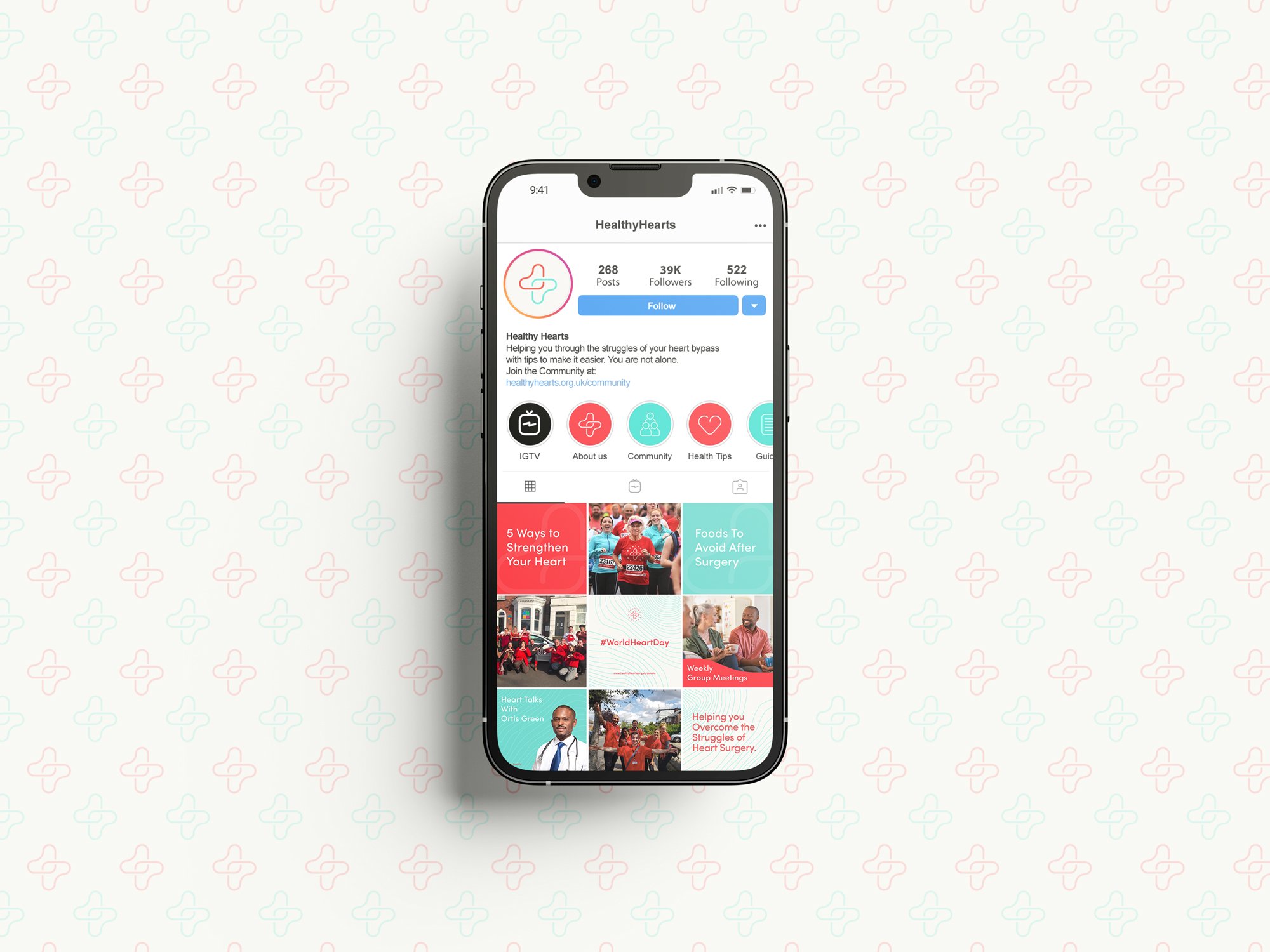
Social Media Design
PROJECT GOALS
To symbolise unity and transparency that also communicates a clinical feel within the target audience.
Stand out from rival heart organisations/foundations.

DESIGNING THE LOGO
I began by choosing the strongest keywords from the brief that reflected the brand’s personality, which were ‘unity’ & ‘health’. I then asked myself how I could combine these concepts in a way that reflected them.
To me, health signifies a cross, as seen on most hospitals and hearts are part of the brand’s name, so I combined the two in an interlocking symbol that helped emphasize the keywords.
The full logo is for use on anything large-scale, as and when it can be placed and the alternative options are for small-scale items/merchandise when space is limited.
Full Logo construction

Alternative Logo Options


COLOUR PALETTE
The Healthy Hearts brand was designed with a bold and vibrant colour palette to ensure the target audience felt welcomed into the brand. The red and blue colours were used to represent health and warmth, with white being introduced to help balance out the two other colours because together they clashed.
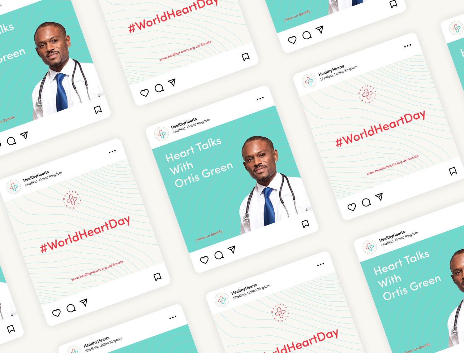
BRAND PATTERNS
The Healthy Hearts patterns are an important element to any brand as they add depth and build stronger brand recognition within the audience. The pulse lines introduce a complimentary aesthetic when used with typography whereas the logo pattern helps signify the brand when used on packaging.


